

It seems like “data storytelling” is all the rage these days. A quick Google search (in early 2020) returns over 100 million results. Even more popular, “effective data visualization” checks in at over 192 million possibilities. You’ve no doubt seen the numerous vendors, certifications, on-line communities, books, consultants, and trainings you can harness to improve your data storytelling and visualization skills. It’s clearly a “thing” now.

Data Visualization Hype Is A Recently-Popular Phenomenon
Much of this has gotten a lot more attention in recent years as big data, the internet of things, and cheap processing power have collided to make so much more available to the average user. At the same time, the volume of data available and the options to analyze and display it are growing almost out of control for that same average user. Thus, to make sense of it, “data storytelling” and “data visualization” have emerged as a must-have skill for the quantitative professional of the future.
Much of the noise about effective visualization has focused on the final product: the intentional choice of a bar graph or line graph, the careful selection of colors and icon shapes, the way you draw the audience’s attention by selective highlighting. Here’s a relevant article about some of those choices. And if you choose poorly? Well, take a look for yourself:


Here’s a link to plenty more examples of what happens (confusion, delay, and often ridicule) if you’re not careful. [Please note, Reddit may be blocked by corporate firewalls. Check out the link at home.]
Maybe that final product is a marketing pitch or a presentation to the Board about a new line of business. Whatever the use, proper application of data presentation techniques is critical to getting the message across effectively.
All of those are good reasons have effective data visualization tools and skills, but it might seem like we actuaries have been left behind. Most of the time as we’re developing models we’re stuck using tabular output data copied from the modeling system into a data warehouse or ad-hoc Excel workbook. We then try to fumble through creating a new visualization that may help us to find the problem, without any regularity or best practices.
That’s not a good way to do it.
It’s inefficient. And it’s ineffective.
Actuaries Can Harness The Power Of Modern Data Visualization
We believe effective data visualization can be useful for every actuary, at every stage of the modeling process. It’s not just at the end when you’re trying to show how many of your Cash Flow Testing scenarios had a negative or positive surplus. It’s not just when you’re trying to make the case for increasing Cost of Insurance charges now to avoid a cliff in the projected margin in a few years. Effective visualization can be useful in model development, validation, and maintenance. Here’s how.
Effective visualization can identify trends or discontinuities that may not be obvious from tabular data.
For example, suppose you have the following set of rates. Is there anything wrong with these?
Rates By Age Band
| Age | Male Nonsmoker | Male Smoker | Female Nonsmoker | Female Smoker |
| 35 | 3.56 | 3.91 | 2.67 | 2.94 |
| 40 | 3.69 | 4.06 | 2.83 | 3.11 |
| 45 | 3.81 | 4.19 | 2.87 | 3.16 |
| 50 | 3.91 | 4.30 | 2.94 | 3.23 |
| 55 | 4.01 | 4.41 | 3.04 | 3.35 |
| 60 | 4.09 | 4.50 | 3.09 | 3.40 |
| 65 | 4.17 | 4.59 | 3.18 | 3.50 |
| 70 | 4.25 | 4.89 | 3.21 | 3.53 |
| 75 | 4.32 | 4.97 | 3.26 | 3.59 |
| 80 | 4.38 | 5.04 | 3.35 | 3.68 |
You might look and think, “Nope, all looks pretty good.” Even if you do the first order differential, would you be able to tell there was something wrong?
Vs. prior Age Band
| Age | Male Nonsmoker | Male Smoker | Female Nonsmoker | Female Smoker |
| 35 | ||||
| 40 | 0.13 | 0.15 | 0.06 | 0.07 |
| 45 | 0.12 | 0.13 | 0.12 | 0.13 |
| 50 | 0.11 | 0.12 | 0.05 | 0.06 |
| 55 | 0.10 | 0.10 | 0.09 | 0.10 |
| 60 | 0.09 | 0.10 | 0.04 | 0.05 |
| 65 | 0.08 | 0.09 | 0.07 | 0.08 |
| 70 | 0.07 | 0.29 | 0.09 | 0.10 |
| 75 | 0.07 | 0.08 | 0.04 | 0.04 |
| 80 | 0.06 | 0.07 | 0.08 | 0.08 |
Maybe. Maybe not.
But if you graph them, you get this:

Clearly something’s going on here, and having the visual shows you that there’s a discontinuity at age 65 for male smokers. What’s the reason? And what’s the fix? We don’t know yet. But we do know that it’s much easier to see this at a quick glance than if you scrolled through pages and pages of tabular output. Imagine if this had been 6 products with 6 classes each? How likely are you to find the error then?
Visualization helps you consider orders of magnitude and issues of materiality.
Listed in a table of results, or in a string of numbers on a page, 1 and 11 don’t look that much different. 9 and 99 don’t look that much different, and they don’t look that much different from 1 and 11. You might easily overlook some kind of mistake or potential issue for concern if you’re just looking at whole, round numbers that force you to do math in your head as to whether or not it’s important.
With an effective visualization, however, you can immediately take in what’s big, what’s small, what’s out of line, and what’s within reason.


With a quick glance here, you can clearly tell that 11 and 9 are pretty close, but 99 dwarfs all of them. And in comparison to the difference between 9 and 99, the difference between 1 and 11 is pretty small. So if you’re looking for the biggest problems to solve first, maybe you’d do better focusing on the what’s leading to your 9 vs 99 differential, rather than your 1 vs 11 differential.
Visualization helps you observe outliers, anomalies, and underlying potential errors.
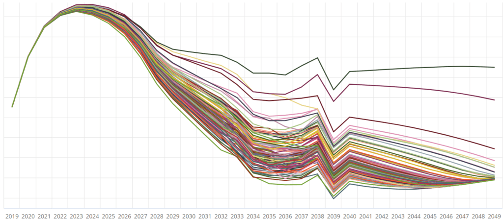
Here’s an example we ran across with some asset reinvestment simulations. One thing we saw was that despite the overall portfolio balance staying about the same, the asset purchases and sales were off the charts, but offsetting from each other.
When we just looked at the total Portfolio Value, we saw something like this:

But when we added in sales and purchases, we saw something like this:

Just looking at the overall portfolio value wouldn’t have given us the insight that something underneath was incorrect. We needed to see, visually, what was going on with the pieces beneath the surface, in order to get the clue that there was an underlying problem.
Obviously, good visualization is a plus for the practicing actuary. So, what makes a visualization good versus just okay?
Good Visualization Is Both Effective and Efficient
Good visualization is effective because it will help you see the trends in your data, understand the outliers, investigate underlying errors, and so forth. And, just as importantly,
Good visualization is efficient because it doesn’t require multiple steps to make it work. How many of us have run a model, then copied a set of data out of that system into an Excel sheet, just to get something we could play around with?
That’s the kind of inefficiency we strive to eliminate with Slope Actuarial Software. We’ve integrated a visualization tool right into the system, so that you no longer have to take extra steps just to see what’s going on with your model.
No more copy – paste – refresh the Pivot Chart – swear under your breath – run the model again – select the appropriate data elements – copy again. Now you can see updated results immediately after every run.
You might think that it’s not that big a deal, it’s only a couple of steps you’re saving. What’s it take to copy and paste, like, two, three minutes? But there’s plenty of reasons not to go down that path, if you can avoid it.
For one, you’ll be saving time. At two minutes per event, it might not seem like a lot. But if you’re in the process of investigating some problem in your model, you might run and re-code and re-run 40 or 50 times in a day. Wouldn’t that extra 80 to 100 minutes be time you could use more productively?
Second, you’ll be reducing your mental load. Fewer steps to complete means you’re less likely to get frustrated at the process. You’re also less likely to just accept a “good enough” intermediate answer, because your brain is tired and wants to get it over with. If you’re so intellectually wiped out that you’re taking shortcuts, that’s actually not good enough for you or your company. Having an efficient data visualization process actually leads to better results because you’re not compelled by technological limitations to look for less-than-ideal solutions.

Effective Visualization Is For Everyone, Not Just Marketers And Graphic Designers
So, there you have it. A few reasons why visualization is good for all stages of actuarial modeling work. It’s not just the final product – all the intermediate sausage-making benefits from a good data “link” too.
